Bar Plots, Histograms, and Distributions
Create a simple Bar graph
import matplotlib.pyplot as plt

working_days = ['Non-Working Day', 'Working Day']
casual_avg = [1371, 607]

plt.bar(working_days, casual_avg)
plt.show()
If we look at the x-tick labels, we only see numbers (from 0 to 6). If we wanted to add day names instead, we can use the plt.xticks() function. The ticks parameter takes in the x-coordinates, and the labels parameter takes in the corresponding new labels:
Horizontal Bar Plot
We call this a horizontal bar plot. The average numbers of bikes rented are now on the x-axis, and the day names are on the y-axis. And we're now talking about bar widths instead of bar heights.
To generate the bar plot above, we can use the plt.barh(y, width) function along with the plt.yticks() function to change the y-tick labels:

Calculate average
Generate a Frequesncy Table
we can group the unique values into equal intervals.
The unique values are now number intervals. (4368.0, 5237.2] is a number interval. The ( character indicates that the starting number is not included, while the ] indicates that the ending number is included. The interval (4368.0, 5237.2] contains all numbers greater than 4368.0 and less than or equal to 5237.2.
Histogram
The best way to visualize a grouped frequency table is by using a histogram. To generate a histogram for our table above, we can use the plt.hist() function👍

Notice that all we needed to pass to plt.hist() was the cnt column (not the grouped frequency table).
Behind the curtains, the plt.hist() function did the following:
Generated a grouped frequency table with ten equal intervals for the cnt column.
Plotted a bar for each interval (ten intervals means ten bars). The height of each bar corresponds to the frequency of its corresponding interval.
A histogram is a modified bar plot — the main visual difference is that there are no gaps between bars.
Another equally-important difference is that each bar represents an interval, not a single value.
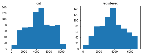
Looking at the histogram we generated for the cnt column, we can make a few quick observations about the following:
Range: Over the two years (2011 and 2012), the values ranged between 0 and 9,000 bike rentals.
The distribution of the bike rentals:
Most typically, the number of bike rentals per day varies between 4,500 and 5,000 — the tallest bar is around that interval. The height of that bar indicates that we had about 140 days when rentals were between 4,500 and 5,000.
For most days, the number of rentals ranges between 1,000 and 7,500 — we see the tallest bars around this larger interval.
Most uncommonly, the number of rentals per day goes under 1,000 or over 8,000 — the bars are short around these values, with a frequency of 20 or less.
Histograms are one of the most common graphs we use in exploratory data visualization. They quickly show us the distribution of the values, which in turn can suggest important patterns
It's useful to examine the shape of a histogram because it shows us the distribution of the values.
We often see histograms with a shape that is more or less symmetrical. If we draw a vertical line exactly in the middle of a symmetrical histogram, then we divide the histogram in two halves that are mirror images of one another.

A histogram shows the distribution of the values, and if its shape is symmetrical, then we say we have a symmetrical distribution.
One common symmetrical distribution is the normal distribution (also called Gaussian distribution).

Let's think of a numerical column for a moment (like the cnt column): it has a minimum value, a maximum value, and a range (the range is the difference between the maximum and the minimum column). If we plot a histogram for this column and the visual result is a normal distribution, then this means the following:
Most of the values in that column lie in the middle of the range.
As we approach the minimum and the maximum points of the range, we have less and less of those values.
To better understand what a normal distribution means, let's say we plotted a histogram with the grades students earned on a math test. If the histogram shows a normal distribution, then this means the following:
Most of the student performances were average (lying somewhere in the middle between the minimum and the maximum marks).
As we approach the minimum and maximum marks, we have less and less students with those performances.
Another symmetrical distribution we can see in practice is the uniform distribution — the values are uniformly distributed. The bars have equal height because the intervals have equal frequencies.

If we plotted a histogram for the grades students earned on a math test, and the distribution is uniform, this means that all the marks (or the mark intervals) have the same frequency.
When we plot histograms in practice, we rarely see perfectly symmetrical distributions. However, these ideal cases we learned about serve as a baseline to help us describe and interpret the distributions we see in practice.
For instance, if we look at the histograms for the cnt and the registered columns, we can say they look similar to a normal distribution. This immediately tells us that most values lie in the middle, and the frequencies gradually decrease toward the extremities.
Let's do a quick exercise and resume the discussion on the next screen, where we learn that not all histograms have symmetrical shapes.
he casual histogram shows a skewed distribution. In a skewed distribution, we see the following:
The values pile up toward the end or the starting point of the range, making up the body of the distribution.
In the case of the casual histogram, the values pile up toward the starting point of the range.
Then the values decrease in frequency towards the opposite end, forming the tail of the distribution.

If the tail points to the right, then the distribution is right skewed (the distribution of the casual column is right skewed). If the tail points to the left, then the distribution is said to be left skewed.
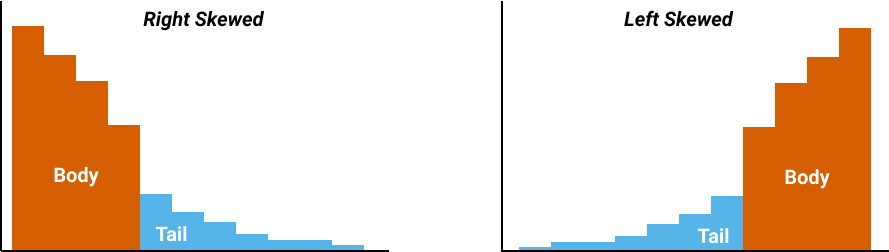
When the tail points to the left, it also points in the direction of negative numbers (on the x-axis, the numbers decrease from right to left). For this reason, a left-skewed distribution is sometimes also said to have a negative skew.
When the tail points to the right, it also points in the direction of positive numbers. As a consequence, right-skewed distributions are also said to have a positive skew.
Last updated