Scatter Plots
Scatter plot can be used to study correlations between two variables. For example bike rentals and temperatures
import pandas as pd
import matplotlib.pyplot as plt

bike_sharing = pd.read_csv('day.csv')
bike_sharing['dteday'] = pd.to_datetime(bike_sharing['dteday'])


plt.scatter(bike_sharing['windspeed'], bike_sharing['cnt'])
plt.ylabel('Bikes Rented')
plt.xlabel('Wind Speed')
plt.show()
There are two kinds of correlation: positive and negative.
Two positively correlated columns tend to change in the same direction — when one increases (or decreases), the other tends to increase (or decrease) as well. On a scatter plot, two positively correlated columns show an upward trend (like in the temp versus cnt plot).

Two negatively correlated columns tend to change in opposite directions — when one increases, the other tends to decrease, and vice versa. On a scatter plot, two negatively correlated columns show a downward trend (like in the windspeed versus cnt plot).

Not all pairs of columns are correlated. We often see two columns changing together in a way that shows no clear pattern. The values in the columns increase and decrease without any correlation.
As a side note, we often call columns in a dataset variables (different from programming variables). For this reason, you'll often hear people saying that two variables (columns) are correlated
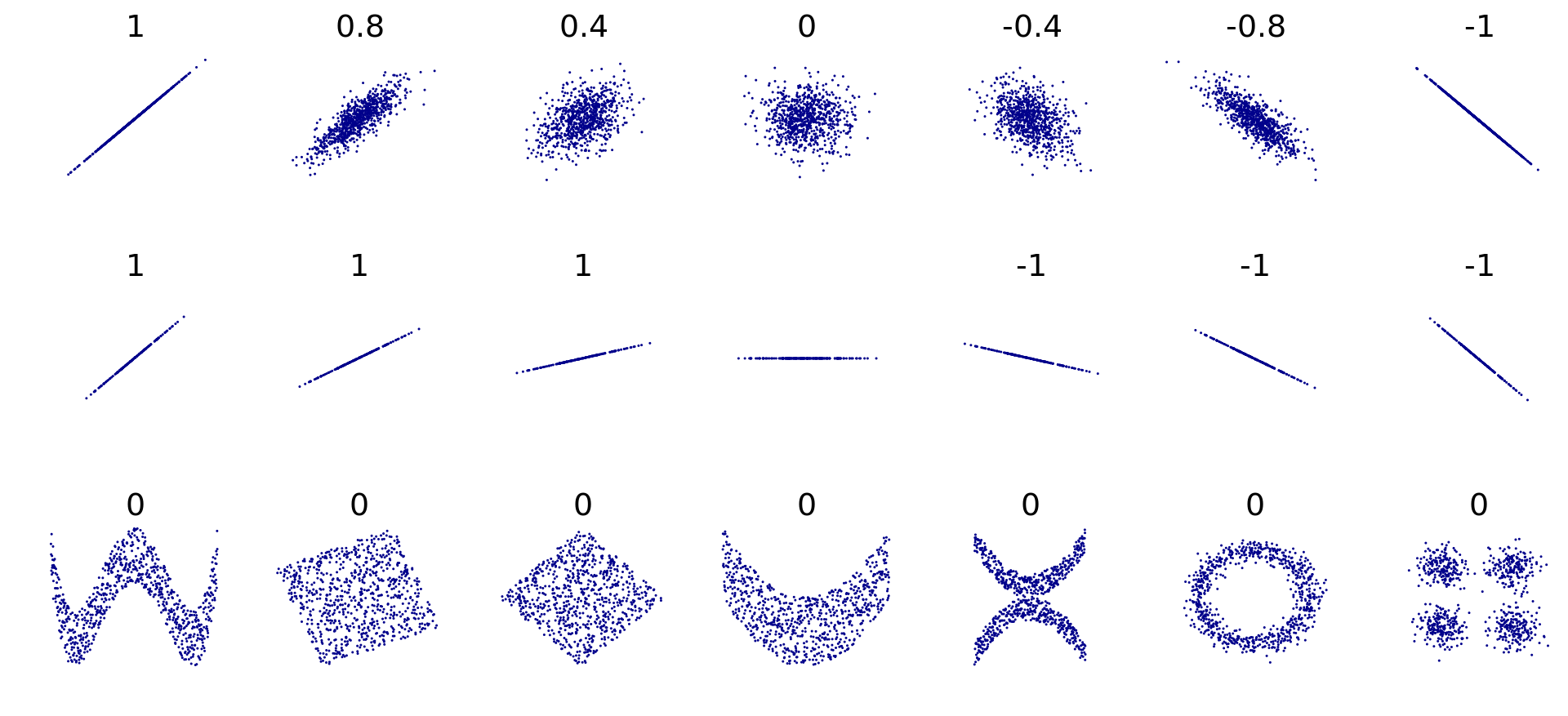
Pearson Correlation Coefficient
The most popular way to measure correlation strength is by calculating the degree to which the points on a scatter plot fit on a straight line.

We can measure how well the points fit on a straight line by using the Pearson correlation coefficient — also known as Pearson's r.
Pearson's r values lie between -1.00 and +1.00. When the positive correlation is perfect, the Pearson's r is equal to +1.00. When the negative correlation is perfect, the Pearson's r is equal to -1.00. A value of 0.0 shows no correlation.

Below, we see various scatter plot shapes along with their corresponding Pearson's r.
If columns X and Y have r = +0.8, and columns X and Z have r = -0.8, then the strength of these two correlations is equal. The minus sign only tells us that the correlation is negative, not that it is weaker.
For example, even though the number +0.2 is greater than -0.6, a -0.6 correlation is stronger compared to a +0.2 correlation.
When we compare correlation strengths, we need to ignore the signs and only look at the absolute r values. The sign only gives us the correlation's direction, not its strength.
To calculate the Pearson's r between any two columns, we can use the Series.corr() method. For instance, this is how we can calculate the two correlations above:
Series.corr() uses a math formula that only works with numbers. This means that Series.corr() only works with numerical columns — if we use string or datetime columns, we'll get an error.
As a side note, teaching the math behind Pearson's r is beyond the scope of this visualization lesson. Here, we focus on how to interpret and visualize correlation.
The Series.corr() method only allows us to calculate the correlation between two numerical columns. We can get an overview of correlations using the DataFrame.corr() method, which calculates the Pearson's r between all pairs of numerical columns.
Let us see an example


Correlation of one column with multiple columns at once
These values suggest that registered users tend to use the bikes more on working days — to commute to work probably. On the other side, casual users tend to rent the bikes more on the weekends and holidays — probably for some leisure time.
Last updated