Line Graphs

Simple Line Graph

month_number = [1, 2, 3, 4, 5, 6, 7]
new_deaths = [213, 2729, 37718, 184064, 143119, 136073, 165003]
import matplotlib.pyplot as plt
plt.plot(month_number, new_deaths)
plt.show()

The plt.plot() function generates a line graph by default. All it needs is two arrays of data of the same length — these can be Python lists, pandas Series, NumPy arrays, etc. Above, we used two Python lists.

On the top left side of the graph, we see an "1e6" sign — this is scientific notation. Matplotlib changes to scientific notation if one value on the axis needs to be one million or greater. If we want to remove scientific notation, we can use the plt.ticklabel_format(axis, style) function.

Similary we can also add labels etc and customize our graph.

Customizing Line Graphs

Customizing Pandas Dataframe

We can also import and prepare our panda dataframe for line graph

We can filter out data and then make a graph

Multiple Plots

If we want 2 separate graphs we can use two show commands

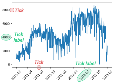
The plt.xticks() function takes its name from the little lines on each axis to show unit lengths. These lines are called ticks, and the corresponding labels are tick labels. The x-axis has x-ticks, and the y-axis has y-ticks — there's also a plt.yticks() function.

Last updated