Seaborn
Relational Plots and Multiple Variables
Seaborn enables us to easily show more than two variables on a graph. Below, we see a graph with five variables (we'll introduce the data and explain the graph later in this lesson).
Although the graph shows five variables, we generated it with a single line of code. Behind the curtains, however, Seaborn used many lines of Matplotlib code to build the graph.
Generating a simple plot.

Visually, the graph uses Matplotlib defaults. To switch to Seaborn defaults, we need to call the sns.set_theme() function👍

Now, can add a third variable as hue

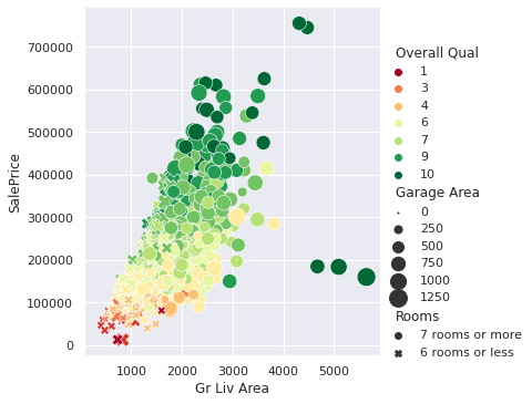
The values in the Overall Qual variable range from one to ten — one is equivalent to "very poor," and ten is equivalent to "very excellent" (per the documentation).
Seaborn matched lower ratings with lighter colors and higher ratings with darker colors. A pale pink represents a rating of one, while black represents a ten. Seaborn also generated a legend to describe which color describes which rating.
Let's say we want the colors to vary between red and green — where dark red means a rating of one and dark green means a rating of ten. We can make this change using the palette parameter with the 'RdYlGn' argument:
The argument 'RdYlGn' contains three abbreviations:
Rd: red
Yl: yellow
Gn: green
The argument 'RdYlGn' as a whole describes a color palette that starts with red, goes through yellow, and ends with green. Below, we see a few color palettes:

Another element we can use to represent values is size. A dot can have a color and x- and y-coordinates, but it can also be larger or smaller. Below, we use a size representation to add the Garage Area variable on the graph — we use the size parameter. Recall that Garage Area describes the garage area in square feet.

To make the size differences more visible, we'll increase the size range — the sizes parameter takes in a tuple specifying the minimum and maximum size.

The sizes parameter can take in a tuple only if the variable we represent is numerical — Garage Area is a numerical variable. The tuple in sizes represents a range. The minimum value in the range maps to the minimum value in the variable. Similarly, the maximum value in the range maps to the maximum value in the variable.
To control the sizes for a non-numerical (categorical) variable, we need to use a list or a dict. Instead of specifying the range, we need to specify the sizes for each unique value in the variable.
The Rooms variable is categorical, and it has two unique values: '7 rooms or more', and '6 rooms or less'. Below, we pass in the list [200,50] to map '7 rooms or more' to a size of 200 and '6 rooms or less' to a size of 50.

Another visual property we can exploit is shape. On the graph we've built, each dot has the shape of a circle. Instead of a circle, however, it could have been a triangle, a square, etc.
More generally, we call the dots on our graphs markers. The marker can take various shapes: circle, triangle, square, etc.
Below, we add the Rooms variable by changing the shape of the markers. A circle now means a house with seven rooms or more, and an "x" sign represents a house with six rooms or less. To make this change, we use the style parameter.
By default, Seaborn chose a circle and an "x" sign to represent the values in the Rooms variable. Recall that Rooms has two unique values: '7 rooms or more', and '6 rooms or less'.
If we're not happy with Seaborn's marker choice, we can change the markers' shape. To see the available shapes, we can check Matplotlib's documentation.
Below, we add different markers using the markers parameter. Each marker shape has a string representation that we can find in the documentation referenced earlier.

We'll add one more variable by spatially separating the graph based on the values in the Year variable. This variable describes the year when a house was built, and it has only two values: 1999 or older and 2000 or newer. For each value, we'll build a separate graph that will display the five variables we've already plotted.
Below, we add the Year column using the col parameter:

Individually, each graph displays only five variables, but together they show six variables — the Year variable and the other five.
The quantity of information we see in the data visualization above is very large. Each column has 2,930 data points (exception: Garage Area has 2,929), which means we condensed 17,579 data points into one picture.
More importantly, however, we managed to visually represent the relationships between all six variables. Although there's so much information, the graph is readable and shows clear patterns.
The graph we built is essentially a scatter plot. However, because it shows the relationships between so many variables, we call it a relational plot.
Last updated